Tuesday, December 28, 2010

PLAYING CARD COLLABORATIONS
These are playing card collaborations done with my friends from the Daughters of a Dog Group. This is another activity shared by our group. These small collages are made onto playing cards and mailed from daughter to daughter. Each daughter makes an artistic contribution to the card, then sends it to the next person. Whoever starts the card gets to keep it.

There will be a show of our journals in Portland, OR in March, 2011, as well as a show of our playing card collaborations.

Thursday, December 23, 2010

ALTERED BOOK PROJECTS - DAUGHTERS OF A DOG
I'm a daughter of a dog. That's right. I said it. I'm a member of a group that does altered books, and it's called Daughters of a Dog. It's a very exclusive group with strict guidelines for membership. People are dying to get into this group. Believe me. The first rule of membership is that you must be a woman over 40 years old. The second is that you must be a collagista extraordinaire. It is an international group formed on deviantart.com and I am honored to be a part of this wonderful, fun group of ladies. I just wish we all lived in the same town. Needless to say, we put some bucks out on postage sending our projects to each other all over the globe. Here are a few spreads I've done so far. I try to do them when I'm not busy with art school projects. They are a joy to do and the friendships made with these talented ladies from all over the world are priceless. Check out the daughters at http://daughters-of-a-dog.deviantart.com/ or you can click the link in my links list on this page.

HERO


SISTERS ONE & ALL


CRAFTY, BUSY DAUGHTERS

Monday, December 13, 2010

STILL LIFE WITH TURKEY FEATHER
This is my final piece for pastel class. I am not totally satisfied with it, but I had to go with it as time ran out. About midway into it, I realized that I really wanted that pomegranate and bird to switch places, but that was not possible, so I just had to keep on trucking. I'm still not that great at setting up a still life on my own. The more you do it, the more you learn though. Anyway, I think this could have been better, but it's not a total loss. I was apprehensive about doing such a large piece (it is 18 X 20) but it went fine. I especially like how the round vase turned out, because I really captured the gradations of the glaze on it pretty well. I will just be glad when I get to the point where my work does not look so much like student work anymore. I suppose that happens when you are not a student anymore? Ha!

Saturday, November 20, 2010

LITTLE MADONNA
This is Nupastels and Rembrandts on Strathmore paper. I'm unhappy with it except for the rocks, which I went to great length on to get right, and I think I did a good job on that. The background is fallen and dead leaves and dirt, and I think I got it too dark for the rest of the picture. In working on that, I kept getting dust on the white robe of the statue, and dulling the whiteness, so I had to keep freshening it. I think that messed it up some. Anyway, I got tired of working on it, but I will be going back to freshen it up and lighten the background some.

This is the little Madonna statue that stands in front of the Church of the Immaculate Conception in Raymond, Mississippi. It is a favorite place of mine.

Monday, November 15, 2010

PAINTERLY PEARS
Another giant fruit trio in pastel on Canson paper. Yum-yum!!!!!!!

Friday, November 12, 2010

TETHYS - WORK IN PROGRESS
I'm almost finished! This is the first sculpture from my beginning class that I really like! It is the first figure we have done. Up to now it's been body parts, skulls and generic heads. This is a reclining figure! Wooooooo! It is terra cotta and is about five inches tall and about 12 inches long.

The theme is Tethys, Greek goddess of seas and mother of rivers, grandmother of Poseidon. She is resting peacefully on a gentle wave. Just a few minor touches and she's ready to be fired.


Sunday, November 07, 2010

FEELING FRUITY
Here are some 12 X 16 pastel paintings I did in pastel class. The goofy names are what my teacher called them, so I will call them that too, since I am also goofy. Though I am somewhat frustrated in the class, I do believe that I'm learning something from it, and I like the medium more than I did before.

Monumental Pomegranates


Lovely Lemons

Sunday, October 31, 2010

NEIGHBORHOOD DOGGIE
This piece is 9 X 12. It is Nupastels, Rembrandt pastels and some charcoal on Strathmore paper. I was assigned a landscape for homework in my pastel painting class. We were supposed to use a photo we had taken or that we had a personal connection to. I did not really have much to choose from in the way of landscapes that particularly excited me. So I picked this photo of a neighborhood doggie that used to join my daughter and me on walks. My daughter, Skye, had snapped a photo of her one day. It's close enough to a landscape to suit me. I mean look at that, there's a big sky and a leafy, grassy area. Viola! Landscape! There just happens to be a giant pug face in the foreground. Darnit, I find most landscapes to be so boring. I had already attempted two others and was stuck until I decided to do this, and finally was able to finish something. I'm telling you, I was on the verge of tears because I thought I was never going to get my blankety-blank homework done. I was feeling like I absolutely had been drained of every drop of talent I ever had. I've been in a rut all weekend. Thank goodness I finally finished something!

Tuesday, September 28, 2010

NOM NOM NOM
It is what it is. It is yum on Granny Golden's vintage china plate, with a glass of pomegranate-blueberry juice. I think a cupcake could be next. With a glass of milk, which is what I actually wanted to do when I set out this time, but they did not have any cupcakes at the store that were good looking enough. Soon kiddies, soon...

Monday, September 27, 2010

CONCEPTUAL SCULPTURE - NIKE
This is a sculpture I did for a project I'm working on in Art History I. I have to do a paper, and an oral presentation with props that include two studio art pieces. This is one of my studio art pieces. My topic is Classical and Hellenistic Greek art. So I have done a conceptual sculpture of Nike, the winged goddess of victory. Most of the statues I have encountered in my research are missing a head, limbs, or both, so my Nike is missing these appendages. Bless her heart, she has retained her wings. I have given her a Hellenistic sweeping garment a a slight contrapposto pose to keep with the style of the periods. I hope she dries out in time!

Thursday, September 23, 2010

BLUE BOTTLE & PEARS
This is a still life on a 9 X 12 piece of Strathmore pastel paper. This is a smooth paper that I decided to try. It has a grainy texture and is gray with some darker slate colored fibers in the paper. It's pretty to look at. I like how it shows through in the drawing. This is not a complicated still life, but I like the colors. The teacher is really good, and has excellent knowledge of the medium, which has really helped a lot. I am really starting to enjoy the class.

Sunday, September 19, 2010

SQUEAKY TRIO
My daughter told me that I needed to do something different from the things I've done in the past. So here is what I did for my last assignment in my pastel painting class. Pastels are a new medium for me. So far I like them fairly well. I used NuPastels and Rembrandt soft pastels on 9 X 6 Strathmore paper for this craziness.

Friday, August 20, 2010

LAST PAINTING OF THE SUMMER
This is my last painting with Ms. Atkinson for the summer. It's a little 8 X 10 piece on a canvas board. My time with her has flown by now. I'm off to new ventures with new instructors at my new school. I will miss painting with her. I've learned much and made a dear friend.

A new era awaits. Let the adventure begin.

Sunday, August 15, 2010

Vegas Dress Shop
This is a digital photo I took on a trip to Las Vegas a couple of years ago. It is inside of a dress shop in the Mandalay Bay Casino complex. I always thought it was nice picture. I decided to play with it in PhotoShop to make it look really artsy. I like the effects I got with the filters I applied to it. I think it could be ready for an art show!

Friday, August 06, 2010

JUST BE
This is a collage on a black mat board with white gesso. It measures 8 X 10. I used ink and a stamp for the background, with a piece fancy fiber paper. The flowers are clipped from an ad. I had saved the nude image from an old calendar. The butterflies are a tape transfer I made, and two acetate images I altered. Obviously the letters are clipped from a magazine. Here and there in the background, I added a bit of torn tape transfer that I made from a piece of scrapbook paper with a music theme. That is where the "2" on her hip came from as well.

This is a fairly uncomplicated piece. I think that's what makes it nice though. The nude image is pretty enough without a lot of fanfare.

Saturday, July 31, 2010

THE PAINTER'S GUARDIAN & YAY! I GET TO CONTINUE SCHOOL!

Over the summmer, I've been a bit bummed. I have run short of money to put toward any more school, and I really wanted to continue my education toward an MFA. This desire has been fueled at the urging of my instructors, who believe I would make a good art teacher. One in particular has been very influential and helpful in pushing me in that direction. Getting money for more school has been the big question.

I finally decided on a path to take and applied to the school I really felt was the right place to go. I was accepted, but had to be accepted by the art department as well. Fortunately, my portfolio was looked upon with favor, and I also was accepted to the art program. With that tackled, the art professor appointed as my adviser told me that he understood my money dilemma and offered me an application for their art department scholarship. He also directed me to the school's financial aid office for help. I made an appointment.

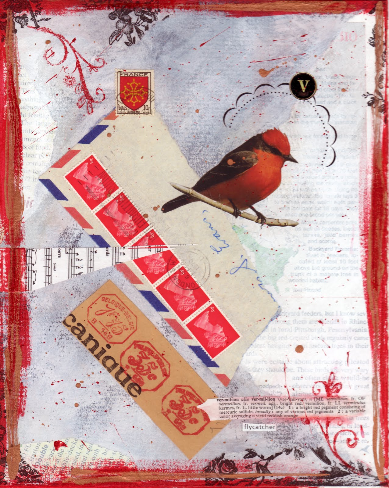
I went to my financial aid appointment with much skepticism, muttering to myself as I trudged up the hill to their offices in the sweltering Mississippi humidity "This is going to be a total waste of time." Fortunately, I'm never right when I have such negativity going into things. The counselor there was helpful and told me that since I have a high GPA, I am eligible for some scholarship money. Enough that I should not turn it down, and hopefully I will be able to swing supplementing the rest; that being due to a certain guardian angel represented by the collage below.

I'm thankful, and excited I'll get to continue my art education, majoring in Fine Art (painting) and minoring in Communications. It's going to be tough, but I really want this badly. I've managed to scratch up the cash for the fall semester, and part of spring. Let's try dis ting.

The Painter's Guardian

Saturday, July 24, 2010

COLLAGES USING PHOTO TEST STRIPS & BOTCHED FILM
When I was taking photography in the spring, I saved test strips and pieces of film that did not turn out, just so I could use them for collage. Seemed a waste to toss them in the trash! Photo supplies are spendiferous! So, I decided to put some of them to use this week, and I put together these collage pieces. The top piece measures 6 X 8 and is done on a recycled gallery canvas. The bottom piece measures 8 X 10 and is done on mat board. Both of these pieces feature the same child in the photo test strip, Miss Hannaboo.

I used gesso, acrylic paints, fancy paper, silver leaf, stamps/ink, clippings, tape transfers, frottage, and paper whatnots as well.


Tuesday, July 20, 2010

ADORE
It's collage time! I got out a piece of 8 X 10 black mat board and went to town on it with some white gesso and acrylic paint. I used a Neenah papers label on there and did some frottage, then scratched it all up. I added an old contour drawing of a fairy doll that I did for drawing class a couple of years ago. I put gesso on a tin leaf and used some tape transfers and ink/stamps as extra accents here and there, then finished it off with some of those little tin corners (originally colored pink) that I painted up with some gold and black gesso. Viola!

Tuesday, July 13, 2010

MIXED MEDIA PIECES ON RECYCLED CANVAS
Recently I cleaned out my studio and a lot of stuff went onto the burn pile. I spent a good day recycling canvasses with gesso in various colors. Many of them were left with interesting textures. I decided that they would make good surfaces for mixed media pieces and used some varying colors of gesso on them. I found some colors I thought looked good together and added some more textures to a couple of the canvasses. Here are the resulting pieces.

I used lots of gesso, ink, stamps, frottage, tape tranfer, clippings, fancy fiber paper, acrylic paints, and vintage hardware I found in NOLA.


SMALL, QUICK STILL LIFE PAINTINGS
These are some still life paintings done in the past few weeks. They are all 8 X 10 done on masonite boards. Everyone has been busy, so studio time at the school has been cut short and we've limited our work to smaller pieces, thus the 8 X 10 size here. I have a couple of larger ones I can post later but these are easy for now.

Some of these items are things I picked up on a recent weekend in New Orleans. The Boviril jar and the shooter marbles were finds in antique stores there. I also found some really cool old hardware that I used in a mixed media piece that I'll post later. The retro cream pitcher is a find that Melanie Atkinson came upon during her recent trip to North Carolina to visit family. It is way cute.

Vintage Bovril Jar & Lantern Flowers


Retro Cream Pitcher With Fruit


Peter's Pottery Bunny With Lilies & Vintage Shooters

Friday, May 28, 2010

SECOND PAINTING OF THE SUMMER
Another Wolfe bird, this time with the lantern flowers that I also love to paint. This one is on a 9 X 12 gallery canvas. I like the colors in this one a lot.

Thursday, May 27, 2010

POTTERY
These items are some of my creations from the beginning ceramics class that I took with Jimmy Tillotson at Hinds CC this Spring. The pot on the left is a coil pot and is a candle holder/incense burner. The center piece is a simple, slab constructed vase. The little pot on the right with the marbles inside is a pinch pot with three little feet added.

I have a few more pieces that I did as well, however, I have not photographed them yet, and a couple of them are still at the ceramics studio awaiting a glaze fire. I really enjoyed the class. Jimmy is a truly unique character, and I am privileged to have had the chance to take a class from him.

Thursday, May 20, 2010

FIRST PAINTING OF THE SUMMER
The ladies are back together painting for the summer. The first ones to turn out have been Kathy, Ms. Melanie and myself. Hopefully more will join us shortly. So sorry Ms. Eugenia could not be with us due to car troubles. We are already thinking of where we might have a show of our summer work.

This is my first painting of the summer. It's oil on canvas and measures 8 X 16. I actually managed to produce two paintings this week, an amazing feat for me. I don't know what is going on with that. This one happened to be dry enough to transport and I wanted to show my mom, as one of the birds belongs to her. I'd been wanting to paint some groupings of Wolfe Studio birds. I got my wish this week. These are a couple of birds from Ms. Melanie's collection, and the bird I gave my mom this past Christmas (the little fat blue one). I adore these little birds. I must go to Wolfe Studio this month and use my coupon they sent me for a discount on one in May/June. More to come! Tweet-tweet!

Thursday, May 13, 2010

LATEST PAINTINGS
These are my latest oil paintings; the last from school. The little Wolfe bird painting is my personal favorite, however, I think "Juicy" is the best one overall. I'll be painting with the ladies in Raymond again this summer and am very much looking forward to that. Hopefully I'll be attending Mississippi College in the fall to continue my art studies and work toward a Masters in Fine Art.

Juicy


Daffodils Are Turning Up


Wolfe Bird With Eggs

Sunday, April 25, 2010

PROJECT 4 - CREATIVE PORTRAITS
We're down to our final projects in Photography class. I was afraid we would not get to do creative portraits because the teacher says it's an advanced project. Some of the students wanted to do night shots, but majority wanted portraits. So we ended up with portraits, or we got to pick from that or night shots. I thought I'd do some of both, but I'm having trouble procuring a cable release cord for night shots, so it's looking like I may just be doing portraits. I'd like to try night shots though, for the experience.

Here's a couple of portrait prints from my first two rolls of film I shot. I've got some excellent negatives for this project. I've followed Randy's instructions for doing portraits, and tried to keep them all in my mind when shooting. So far so good. He's really a great photography teacher. I've got some great models too.

Tommy dans un tube


les meilleurs amis

Saturday, April 24, 2010

A COUPLE OF PAINTINGS
Here are a couple of paintings I've done lately. I still don't know where I'm headed with painting. Most of the pieces I've done lately I've not been happy with. These I was ok enough with to share.

Peter's Pottery Bunny Still Life
Oil on masonite board. Measures 8 X 20.


Twiggy
Oil on masonite board. Measures 12 X 16.

Friday, April 02, 2010

LOCAL ART ASSOCIATION SPRING SHOW WINNERS
I like to participate in the two shows per year that a local art association I'm a member of puts on in the spring and fall. It keeps me active in our art community, and they have really nice receptions with delicious homemade treats furnished by our members ;-) These are two pieces that did well in the show this time. This spring show was judged by local artist Bebe Wolfe, owner of Wolfe Studio and daughter of artists Karl and Mildred Wolfe.

It means a lot when others give attention to work that you actually like yourself. Most of my work, I don't really like at all, and I think most artists tend to be that way. These two pieces, however, I do like and am happy that they were recognized.

Vermillion 14c is a mixed media piece that took first place in the mixed media category. I'm really pleased with my first place ribbon, as it's the first time I've actually placed in a show there with anything other than honorable mention. It's a large accomplishment to get first place in any category as there are so many wonderful artist members in this group, and the competition is very tough! Moreover, I'm pleased because I personally like this piece a lot. It represents a style of mixed media that I believe I will stick with for a long time.

Vermillion 14c


Introspectif was entered into a non-judged special category themed "Angels." The special category was voted on by the people attending the show, and awarded a People's Choice ribbon. This is a photo manipulation that I constructed from many different free stock bits and pieces into PhotoShop, then used various PhotoShop techniques to create different effects to make one picture. I am tickled that this piece took the People's Choice ribbon. The piece is special to me, as it is representative of my childhood.

Introspectif

Saturday, March 13, 2010

THE WELL LOVED ONES
I found these old dolls at a flea market. I thought they'd make good photo models. I also used these girls in Project 2 for photography class.


Portraits
Portraits for Project 2 in my photography class.


Sunday, March 07, 2010

THE TORN SKY
Here's a photo for Project 2 in my Photography class. Project 2 requirements are for blurred action shots, stop action shots, shallow and greater depth of field shots. This is one of my blurred action shots. It is the most technical of the requirements.

Yay me! Because I overcame some obstacles for this photo. I actually got some light and shadow in this photo, and I shot it outdoors, which I'd resigned myself to having to likely shoot indoors, which we are not supposed to per class requirements. My teacher had told me I'd probably have to though, and gave me permission to do so. BUT I took advantage of a cloudy day, and put a luminous object in there to catch some light.

I like this photo a lot due to the technical aspects involved; the most technical actually being figuring out the darned tripod required in order to use the optimal low shutter speed needed to shoot the blurred action...heeheehee ;-)

Saturday, March 06, 2010

THE WAY OF WU WEI IS A WINNER
This four page magazine spread that I did for my Porfolio class was chosen by the Art department faculty at my college for entry into the State Community College Competitive Art Exhibition this year. I am so pleased that it took first place in the Graphic Art category at the competition! I am even more pleased with this win because the competition was judged this year by a graphic arts person, which lets me know that my graphics work is really strong. Pieces of my fine art work have been sent to this competition for three semesters, and it's hard to win something. There is a lot of talent in our state community and junior colleges. None of my art has ever taken even a ribbon. Finally I took a major prize, which has a small monetary award, but the prestige is really a huge deal. Yippee!!


Sunday, February 28, 2010

SECOND PROJECT = SHALLOW DEPTH OF FIELD
I'm working on my second project in Photography class. Here are the teacher's picks for my shallow depth of field shots. I took an entire roll. I also have to do stop action, blurred action and greater depth of field shots for this project. I plan to do a roll of each, so I have a better chance of getting some actual good photos to turn in, and to keep.

These are all 5 X 7 prints. The one at the top really needs to be made into an 8 X 10 to show a cascading sequence of objects occurring in the photo, but it can't be seen in this cropped version. I'll update when I can get an opportunity to print an 8 X 10.